Space Crawler
A downloadable game for Windows and macOS
A point and click adventure game made by Anagh, Jeff, and Kevin
An adventurer has gone missing in a new dungeon. It is your job to venture into the perilous depths and rescue the missing adventurer and come out alive.
| Status | Released |
| Platforms | Windows, macOS |
| Authors | kvn.yap, anaghkanungo7, Jeffreyliu321 |


Comments
Log in with itch.io to leave a comment.
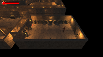
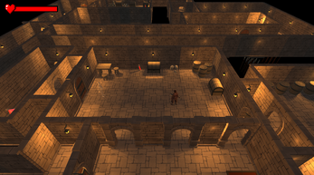
I found the way the game operated to be very interesting. I liked how the camera moved from room to room as you played - it reminded me of games such as Baldur's Gate and I thought that was great. I felt that the fact you could see into other rooms without being there was a bit odd though. If I had a suggestion it would be to somehow obscure rooms you hadn't been to yet. Controlling the character felt a bit awkward in my opinion, but overall the game was great.
I love the overarching theme of the game, and I thought that it was well fulfilled with the assets used and the dialogue. I also thought that the inventory system was also a really nice touch. I think the movement was a little laggy, but otherwise, great game.
First of all this game is awesome. The cinematics of just walking around are amazing. Plus the view that you get right from the start really makes this game one of a kind for our class. Just such a cool vibe.
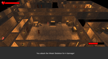
Personally a more in line notification of when you do damage would be awesome. Currently its just a black box at the bottom but maybe a medieval writing type style on the bottom would've looked cooler. Also although the health bar is pretty cool, it is quite basic so maybe adding more feature to that would've been awesome.
Great game though :)
The gameplay is fun overall, and like most people, I agree the camera movement is well done. The inventory system is cool and a mechanic that I couldn't imagine implementing myself. Overall it's very impressive and you can see the amount of time and effort put into to it. (Kaya)
The camera movement is awesome, it gave a strong cinematic feel to the game (reminding me of RE1). The music is so very intense for the moment, and honestly im here for it. Moving around furniture feels awkward and the guy jitters around a lot when trying to move. I think I ran over every spike in the game.
The camera transitions and settings are all really well done! I enjoyed the combat system, but it seemed like a lot repetition with the dialogue. The health bar icon is a really nice UI touch that makes it a lot easier to understand. Nice work!
I enjoyed this game; cuz I love escape room games. I really liked the different (hidden) clues and rooms. I think the movement could have been better. And I think some minor details could have been better. But overall I enjoyed it a lot with the game.
Really nicely designed level and I like the camera rotations. A little hard to figure out where to go next at times so some help there would be nice. The inventory works great but it's design could use some decorating to match the aesthetic of the rest of the world. Also it's possible to use a key in the inventory like a potion and have it be deleted, soft locking you in a room if you needed it. I like the test prompts too, they went away a bit too quickly so I didn't have too much time to read the whole thing.
This game really reminds me of runescape with the dungeon aesthetic and the way the camera works shifting from room to room. Also really enjoy the Bleach soundtrack you used! The dialogue that added a lot of flavor to the game but I think it got a bit old after a bit because it just repeated the same lines again and again. Traversal was a bit annoying, especially trying to collect the keys because sometimes my character just wouldn't respond very well to where I was clicking. Really cool game and aesthetic!
I love how the camera moves, it's a great idea! Probably because of all the assets though, player movement was a bit laggy for me. Also once I clicked somewhere for the player to move, it would perform extra actions like rotate. The chests confused me for a while about what exactly I was getting, I'm guessing now that it replenishes health? Maybe making that more clear would be nice. I also wish you could replenish health outside of battles, I fell for like every trap and it was hard. Great game!
I really like the aesthetic of your game! The assets are really cool, and the camera movement as it transitions between areas of the map is well done. You did a good job creating an atmospheric environment. However I wish there was one of those speed multipliers some RPGs have for combat turns and actions to speed up the fighting, since it is a little lengthy. Good job!
The layout of the maps are really cool and I love the textures and animations for this game. The text for the game is also a really cool though. I think maybe some of the combat could be sped up since it takes a bit too long. I love the camera transitions between all of the different scenes.
I really like the camera movement and how well the game is designed. The speech bubbles in the beginning is really helpful; however, when I accidentally clicked out of the speech bubble area, it disappeared and couldn't view the message again.
The RPG dungeon aesthetic is super cool. I really enjoyed the turn-based attack mechanic. I would've liked it even more if there was even more variety of options, but given the project's time constraints, it makes sense why the attacks are as limited as they are. The camera movement was very well done as well.
I really like the aesthetic and the dialogue of the game, as well as the implementation of chests hiding items. It makes it feel almost like a level of a complete game. I also like the turn based combat; it's unique and it works well with this game. One small issue I do have is the final fight against the skeleton. His hp bar was not going down for quite a bit so i thought i softlocked myself into death but it seems to just be hp bar overflow.
I really like the RPG turn-based combat + inventory system and the assets/environment in the game. The dialogue that appears when you interact with items is a really nice touch too. It would be nice to have a way to lower the music volume a little.